");}.share-twitter, .share-tw, .share-twitter:hover, .share-tw:hover{background-image:url("data:image/svg+xml, ");}.share-linkedin, .share-linkedin:hover{background-image:url("data:image/svg+xml, ");}.share-instagram, .share-instagram:hover{background-image:url("data:image/svg+xml, ");}.share-email, .share-email:hover{background-image:url("data:image/svg+xml, ");}.share-pinterest, .share-pinterest:hover{background-image:url("data:image/svg+xml, ");}.share-youtube, .share-youtube:hover{background-image:url("data:image/svg+xml, ");}.share-tumblr, .share-tumblr:hover{background-image:url("data:image/svg+xml, ");}.share-reddit, .share-reddit:hover{background-image:url("data:image/svg+xml, ");}.share-copy-link, .share-copy-link:hover{background-image:url("data:image/svg+xml, ");}.share-flipboard, .share-flipboard:hover{background-image:url("data:image/svg+xml, ");}.share-whatsapp, .share-whatsapp:hover{background-image:url("data:image/svg+xml, ");background-color:#0000 !important;border-radius:0 !important;}.share-tiktok, .share-tiktok:hover{background-image:url("data:image/svg+xml, ");}.share-sms, .share-sms:hover{background-image:url("data:image/svg+xml, ");}.footer .share-facebook, .footer .share-facebook:hover, .hamburger .share-facebook, .hamburger .share-facebook:hover{background-image:url("data:image/svg+xml, ");}.footer .share-twitter, .footer .share-twitter:hover, .hamburger .share-twitter, .hamburger .share-twitter:hover{background-image:url("data:image/svg+xml, ");}.footer .share-linkedin, .footer .share-linkedin:hover, .hamburger .share-linkedin, .hamburger .share-linkedin:hover{background-image:url("data:image/svg+xml, ");}.footer .share-instagram, .footer .share-instagram:hover, .hamburger .share-instagram, .hamburger .share-instagram:hover{background-image:url("data:image/svg+xml, ");}.footer .share-email, .footer .share-email:hover, .hamburger .share-email, .hamburger .share-email:hover{background-image:url("data:image/svg+xml, ");}.footer .share-pinterest, .footer .share-pinterest:hover{background-image:url("data:image/svg+xml, ");}.footer .share-youtube, .footer .share-youtube:hover, .hamburger .share-youtube, .hamburger .share-youtube:hover{background-image:url("data:image/svg+xml, ");}.footer .share-tumblr, .footer .share-tumblr:hover, .hamburger .share-tumblr, .hamburger .share-tumblr:hover{background-image:url("data:image/svg+xml, ");}.footer .share-flipboard, .footer .share-flipboard:hover, .hamburger .share-flipboard, .hamburger .share-flipboard:hover{background-image:url("data:image/svg+xml, ");}.footer .share-whatsapp, .footer .share-whatsapp:hover, .hamburger .share-whatsapp, .hamburger .share-whatsapp:hover{background-image:url("data:image/svg+xml, ");background-color:#0000 !important;border-radius:0 !important;}.footer .share-tiktok, .footer .share-tiktok:hover, .hamburger .share-tiktok, .hamburger .share-tiktok:hover{background-image:url("data:image/svg+xml, ");}.search-tooltip:after{content:"";display:block;width:15px;height:7px;position:absolute;top:-7px;left:16px;}.generic-slideshow .posts-custom .slick-arrow:before{position:absolute;left:0;right:0;bottom:0;top:0;margin:auto;font-size:21px;font-weight:400;content:"";width:.45em;height:.45em;border-right:.14em solid #fff;border-top:.14em solid #fff;opacity:1;}.generic-slideshow .posts-custom .slick-arrow.slick-prev:before{transform:rotate(224deg);margin-left:.58em;}.generic-slideshow .posts-custom .slick-arrow.slick-next:before{transform:rotate(45deg);margin-right:.58em;}@media (min-width: 768px){.generic-slideshow .posts-custom .slick-arrow:before{font-size:38px;}}.post-page-container .main-column .widget:not(:has(.widget__head)) .row .col:before, .post-page-container .widget:not(:has(.widget__head)) .row .col:before, [id^="sPost_Satic_Page_Layout"] .widget:not(:has(.widget__head)) .row .col:before, .widget:not(:has(.widget__head)) .widget__body:empty{content:none;}.widget:not(:has(.widget__head)) .widget__body:empty{padding:0;}.widget:not(:has(.widget__head)) .row .col:before, .sidebar .widget:not(:has(.widget__head)) .row .col:before, .aside-below-post .aside-top-5-module .widget:not(:has(.widget__head)) .row .col:before{content:"";outline:1px solid var(--additional);line-height:1.4;display:block;padding-bottom:56.25%;background-image:url("https://assets.rbl.ms/56083742/origin.png");background-repeat:no-repeat;background-size:contain;background-position:center;}.recirculation_post.recirculation_post .widget:not(:has(.widget__head)) .row .col:before{content:"";aspect-ratio:1 / 1;padding:0;background-color:var(--white-color);outline:1px solid #ebebeb;}.topbar_sticky_wrapper{height:57px;}.topbar{background:var(--white-color);border-bottom:1px solid var(--additional);}.topbar_row_1{display:grid;align-items:center;justify-content:center;grid-template-columns:auto 1fr auto;padding:10px 0;}.topbar_row_2{display:none;}.topbar_row_1 .list{display:none;}.hamburger__toggle{width:24px;height:24px;display:flex;align-items:center;justify-content:center;flex-wrap:wrap;margin-right:24px;background-repeat:no-repeat;background-position:center;}.search_toggle{width:32px;height:32px;background:url("data:image/svg+xml,%3Csvg xmlns='http://www.w3.org/2000/svg' width='24' height='24' viewBox='0 0 24 24' fill='none'%3E%3Cpath fill-rule='evenodd' clip-rule='evenodd' d='M18.319 14.4326C20.7628 11.2941 20.542 6.75347 17.6569 3.86829C14.5327 0.744098 9.46734 0.744098 6.34315 3.86829C3.21895 6.99249 3.21895 12.0578 6.34315 15.182C9.22833 18.0672 13.769 18.2879 16.9075 15.8442C16.921 15.8595 16.9351 15.8745 16.9497 15.8891L21.1924 20.1317C21.5829 20.5223 22.2161 20.5223 22.6066 20.1317C22.9971 19.7412 22.9971 19.1081 22.6066 18.7175L18.364 14.4749C18.3493 14.4603 18.3343 14.4462 18.319 14.4326ZM16.2426 5.28251C18.5858 7.62565 18.5858 11.4246 16.2426 13.7678C13.8995 16.1109 10.1005 16.1109 7.75736 13.7678C5.41421 11.4246 5.41421 7.62565 7.75736 5.28251C10.1005 2.93936 13.8995 2.93936 16.2426 5.28251Z' fill='%23666666'/%3E%3C/svg%3E") center no-repeat;background-size:24px 24px;}.site-title{margin:0;line-height:0;}.site-logo{height:26px;width:90px;}.topbar__right{margin-left:auto;}@media (min-width: 1024px){.hamburger, .menu-global{display:none;}}@media (min-width: 1024px){.topbar_sticky_wrapper{height:123px;}}@media (min-width: 1024px){.hamburger__toggle{display:none;}}@media (min-width: 1024px){.site-title{justify-content:center;display:flex;}}@media (min-width: 1024px){.site-logo{height:63px;width:204px;}}@media (min-width: 1024px){.topbar_row_2{display:flex;padding:7px 32px;align-items:center;justify-content:center;background:var(--primary-text-color);}}@media (min-width: 1024px){.topbar_row_2 .menu_item .text-element, .navbar .menu__dropdown .list{font-size:14px;}}@media (min-width: 1024px){.topbar_row_1 .list{display:flex;}}@media (min-width: 1024px){.topbar .list__item{padding:8px 12px;}}@media (min-width: 1024px){.topbar .list__item:not(:last-child){margin-right:10px;}}@media (max-width: 1023px){.navbar{display:none;}}.topbar-sticked .navbar .menu_item a, .topbar-sticked .navbar .menu_item a:hover{color:var(--primary-text-color);}.navbar .menu_item.sticky-visible, .topbar-sticked .topbar_row_1 .list, .topbar-sticked .navbar .menu_item.sticky-hidden{display:none;}.navbar .menu_item.sticky-hidden, .topbar-sticked .navbar .menu_item.sticky-visible{display:flex;}@media (min-width: 1024px){.main{margin-left:-2px;margin-right:3px;}}.topbar__right{display:flex;align-items:center;}.topbar__right > :not(:last-child){margin-right:16px;}.topbar .btn.subscribe{font-family:var(--secondary-font-family);}.topbar .btn.subscribe svg{margin-right:8px;width:20px;}@media (min-width: 1024px){.topbar .btn.subscribe svg{margin-right:12px;}}.navbar_inner .menu_items{display:flex;}.navbar .menu_item{position:relative;padding:8px 12px;display:flex;align-items:center;}.navbar .menu_item .dropdown-arrow{margin-left:12px;border-style:solid;border-width:6px 6px 0;}.navbar .menu__dropdown{position:absolute;top:100%;left:0;height:auto;pointer-events:none;overflow:hidden;max-height:0;transition:all .4s;opacity:0;padding:5px;margin-left:-5px;}.navbar .menu_item:hover .menu__dropdown{max-height:calc(100vh - 200px);opacity:1;pointer-events:initial;z-index:3;}.navbar .menu__dropdown .list{list-style:none;margin:0;min-width:220px;padding:10px 20px;border-top:2px solid var(--primary-accent-color);background:var(--white-color);box-shadow:0 4px 4.5px #00000042;}.navbar .menu__dropdown .list a{display:block;margin:15px 0;width:fit-content;padding:0;}.newsletter-modal{display:flex;position:fixed;right:0;top:0;width:100%;height:100%;background:var(--ffffff, #fff);box-shadow:-37px 4px 29.1px #00000040;z-index:999999;overflow:auto;padding-bottom:30px;align-items:center;justify-content:center;max-width:344px;padding:40px 20px 20px;transform:translateX(150%);transition:all .3s;}.newsletter-modal-body{display:grid;grid-gap:24px;text-align:center;}.newsletter-modal-body svg{margin:auto;margin-bottom:16px;}.newsletter-modal__headline{margin:0;}.btn.newsletter-modal_close-pop-up{position:absolute;right:20px;top:20px;width:24px;height:24px;opacity:.3;font-size:0;background:none;display:flex;align-items:center;justify-content:center;padding:0;outline:0;transition:all .3;}.btn.newsletter-modal_close-pop-up:hover{opacity:1;}.btn.newsletter-modal_close-pop-up:before, .btn.newsletter-modal_close-pop-up:after{position:absolute;left:11px;content:" ";height:24px;width:2px;background-color:#000;}.btn.newsletter-modal_close-pop-up:before{transform:rotate(45deg);}.btn.newsletter-modal_close-pop-up:after{transform:rotate(-45deg);}.newsletter-modal .newsletter-element__form{display:grid;grid-gap:16px;}.newsletter-modal .newsletter-element__input{border-radius:var(--1x, 4px);border-style:solid;border-width:1px;background:var(--White, #fff);height:54px;width:100%;font-size:14px;font-style:normal;font-weight:400;line-height:156%;text-align:left;padding:12px 24px;}.newsletter-modal .newsletter-element__submit{position:relative;width:100%;height:50px;border:0;border-radius:4px;}@media (min-width: 768px){.newsletter-modal{max-width:428px;padding:40px 32px;}}.hamburger{width:100%;transition:all .4s;padding:24px 24px 120px;transform:translateX(-100%);position:fixed;top:0;z-index:999999;height:100vh;overflow:auto;}.hamburger_inner{display:grid;grid-gap:24px;}.hamburger .hamburger__toggle{margin-left:auto;margin-right:0;}.hamburger .search-widget{position:relative;border-radius:4px;padding:12px;margin-bottom:16px;}.hamburger .search-widget__submit{position:absolute;height:16px;left:12px;top:14px;width:16px;background:url("data:image/svg+xml, ") center no-repeat;}.hamburger.hamburger .search-widget__input.search-widget__input{text-indent:14px;color:var(--tertiary-text-color);font-family:var(--secondary-font-family);font-size:14px;font-style:normal;font-weight:400;border:0;}.hamburger .search-widget__submit.fa:before{display:none;}.hamburger__menu{margin-top:-16px;}.hamburger .menu_item{position:relative;display:flex;align-items:center;flex-wrap:wrap;}.hamburger .menu_item .text-element{padding:16px 12px;position:relative;text-transform:uppercase;font-weight:700;}.hamburger .menu__dropdown{display:block;width:100%;}.hamburger .dropdown-arrow{display:flex;height:16px;width:40px;align-items:center;}.hamburger .dropdown-arrow:before{margin-left:12px;border-style:solid;border-width:6px 6px 0;border-color:#fff #0000 #0000;cursor:pointer;content:"";}.hamburger .active .dropdown-arrow:before{transform:rotate(180deg);}.hamburger .menu__dropdown .list{margin:0 24px;padding:0;max-height:0;overflow:hidden;opacity:0;}.hamburger .menu__dropdown .list__item{width:100%;position:relative;padding:0;}.hamburger-social{display:flex;align-items:center;}.hamburger-social .text-element{margin-right:16px;}.hamburger .social-links__link{border-radius:4px;width:24px;height:24px;background-size:14px;}.hamburger .social-links__link.share-facebook{background-size:8px;}.hamburger.hamburger .search-widget__input{text-indent:0;}@media (min-width: 768px){.hamburger{max-width:337px;}}@media (min-width: 768px){.hamburger .search-widget__submit, .hamburger .search-widget__submit:after{content:"";display:none;}}@media (min-width: 768px){.hamburger .search-widget__input{padding:0 12px 0 30px;}}.article .widget, .post-image-author .widget{border:0;}.widget__headline.h1{cursor:initial;}.article .widget .widget__body{padding:0;}.body p a, .body *{overflow-wrap:anywhere;}.widget__body .post-tags-primary, .widget__body #utm_campaign, .widget__body .js-scroll-trigger, .article .body-description .js-appear-on-expand{margin:0;}.share-copy-link .icons-share:before{content:"";line-height:18px;}.article .widget .widget__body .body{width:100%;}.article .body p a:hover{text-decoration:none;}.article .body blockquote:before{display:block;content:"";width:24px;height:18px;background:url("data:image/svg+xml, ") 50% no-repeat;margin-right:12px;}.article .body .rm-embed-container blockquote:before{display:none;}.article .body:has(ol[start]), .article .body:not(:has(ol[start])) ol, .article .body:has(ol[start]) ol[start] ~ ol:not([start]), .article .body:has(ol[start]) ol:not([start]) ~ ol:not([start]){counter-reset:olitems;}.article .body ol li:before{content:counter(olitems);display:block;position:absolute;left:0;top:2px;border-radius:50%;height:25px;width:25px;font-size:12px;line-height:25px;color:#fff;text-align:center;}.article .body ul li:before{content:"";display:block;width:5px;position:absolute;left:0;height:5px;top:.8em;margin-top:-2.5px;border-radius:50%;}.article .body img{object-fit:cover;}.body .share-buttons ul li:before{display:none;}.article .tags:before{content:"TAGS:";width:100%;color:var(--primary-text-color);font-family:var(--secondary-font-family);font-size:11px;font-style:normal;font-weight:500;line-height:125%;letter-spacing:.66px;text-transform:uppercase;}.widget__shares:before{content:"SHARE:";margin-right:16px;}.author_details_border:after{position:absolute;content:"";width:0;height:0;border-bottom:20px solid var(--primary-accent-color, #2088d1);border-right:20px solid #0000;border-top:20px solid #0000;border-left:20px solid #0000;top:-40px;left:0;right:0;margin:auto;}.first-author-info .author_details_border:after{left:-90px;}@media (min-width: 1024px){.post-author:hover .author_details_wrapper{display:block;}}.article:has(.widget__brief) span[data-post-url]{display:none;}.stream__article .widget__shares:before{display:none;}.widget__brief > :last-child:after{content:"Keep Reading →";font-style:italic;padding-left:116px;margin-left:-116px;font-weight:bold;background:linear-gradient(90deg, #fff0 0%, #fff 112px);}.widget__headline:hover ~ .body .widget__brief > :last-child:after{text-decoration:underline;}.stream__article .widget__headline-text:after{position:absolute;bottom:24px;left:0;width:100%;height:40px;content:"";display:block;}.video-teaser .widget__head > a:before{content:"";background-image:url("data:image/svg+xml,%3Csvg xmlns='http://www.w3.org/2000/svg' width='26' height='27' viewBox='0 0 26 27' fill='none'%3E%3Crect y='0.625488' width='26' height='26' rx='2' fill='%23B8E2FF'/%3E%3Cpath d='M8 10.2536C8 8.68648 9.73366 7.73998 11.0519 8.58741L17.0748 12.4593C18.2877 13.239 18.2877 15.012 17.0748 15.7917L11.0519 19.6636C9.73366 20.511 8 19.5645 8 17.9974V10.2536Z' fill='white'/%3E%3C/svg%3E");width:26px;position:absolute;left:10px;bottom:10px;background-repeat:no-repeat;height:26px !important;}.article{max-width:680px;margin:auto;}.custom-desktop-extra-large-post-headline .widget .widget__headline, .body h2{font-size:26px;}.body h2{font-size:25px;}@media (min-width: 1024px){.custom-desktop-extra-large-post-headline .widget .widget__headline{font-size:50px;}}@media (min-width: 1024px){.body h2{font-size:34px;}}.article .body img{max-width:100%;width:auto;margin:auto;}h2{text-align:left !important;}.footer{position:relative;background:var(--white-color);border-top:4px solid var(--secondary-accent-color);}.footer__inner .text-element, .footer .list__item{color:var(--primary-text-color);font-family:var(--secondary-font-family);font-size:14px;font-style:normal;font-weight:400;line-height:140%;text-transform:uppercase;}.footer__inner{text-align:center;display:grid;padding:24px 40px;grid-gap:20px;}.footer .list{display:flex;justify-content:center;gap:8px;flex-wrap:wrap;}.footer .list__item{margin:0;flex-shrink:0;padding:0;}.image-element__img{max-width:220px;}.footer__first-row{width:100%;align-items:center;display:flex;justify-content:space-between;flex-direction:column;margin-bottom:16px;}.footer .social-links .social-links__link{height:24px;width:24px;background-color:var(--secondary-accent-color);border-radius:4px;background-size:14px;}.footer .social-links__link > span{display:block;}.footer .social-links .social-links__link.share-facebook{background-size:8px;}@media (min-width: 1024px){.footer__inner{display:flex;justify-content:space-between;align-items:center;flex-wrap:wrap;text-align:left;gap:0;}}@media (min-width: 1024px){.footer .list{grid-gap:24px;}}@media (min-width: 1024px){.footer__inner .text-element{margin-top:8px;width:100%;}}@media (min-width: 1024px){.footer__first-row{flex-direction:row;}}@media (min-width: 1024px){.image-element__img{margin-left:-5px;}}@media (min-width: 1024px){.footer-links{width:100%;margin-top:16px;}}@media (min-width: 1024px){.footer .social-links{margin:0;display:flex;justify-content:center;position:absolute;top:40px;right:40px;}}@media (min-width: 1024px){.footer .list{justify-content:flex-start;}}.floating-btn{position:fixed;bottom:15%;right:-45px;transform:rotate(270deg);}.floating-btn a{border-radius:8px 8px 0 0;border:2px solid #fff;background:#016ff2;padding:9px 10px;text-decoration:none;color:#fff;font-size:15px;}.floating-btn a span{font-size:15px;color:#fff;}.floating-btn a svg{margin-left:5px;}
Career - Asian Hospitality
Skip to content
Search & Section Navigation close Search
Human content,
AI powered search.
Close Start your day right! Get latest updates and insights delivered to your inbox.
Close Search & Section Navigation
Together we’ll forever change the way data drives Business2 VIDEO
VIDEO
Our Awards Events
GG2 LEADERSHIP AWARDS 2016
The leading CEO of Reckitt Benckiser, who has led his company to unprecedented levels of growth, scooped the top accolade at the GG2 Leadership Awards.
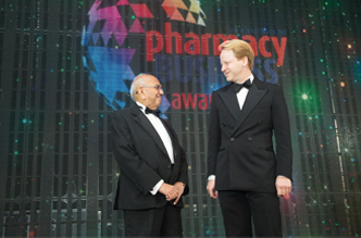
PHARMACY BUSINESS AWARDS 2016
In its 16th year, the Pharmacy Business Awards shone a light on the critical role community pharmacy plays in an NHS struggling against a dearth of funds and overwhelming patient demend…
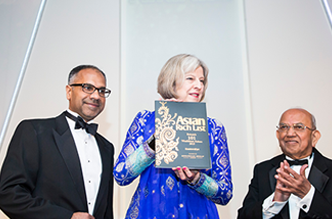
ASIAN BUSINESS AWRDS 2016
THE ASIAN BUSINESS Awards, which celebrate the success of entrepreneurs from the commumity, are open for nominations ahead of the annual event in Spring 2016.
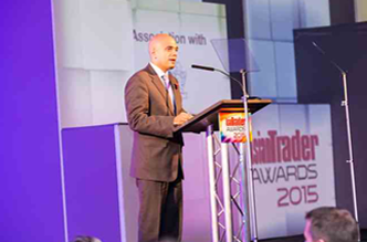
ASIAN TRADER AWARDS 2016
LONDON retailer Hitesh Patel was named Asian Trader of the Year at the 27th annual Asian Trader Awards, the top event in the grocery industry calendar.
About The Group
Asian Media & Marketing Group was established in the UK in 1968. Today our business operations include offices in the US, UK and India. Our websites attract 100,000 unique visitors each week and our business and consumer publications reach over 500,000 readers each month.
We provide cost-saving services for publishers and businesses that include: design; layout of magazines, newspapers, directories and catalogues; digital publishing, printing, subscription packaging, distribution and verification; web design, newspaper, magazine and online advertising and promotions, direct marketing – mailing and door drops; event management; translation services and calf center services for research, debt recovery and sates.